Kolibri is an open-source edtech platform built for global communities facing barriers to education access. Its coach reports let teachers assign learning materials and track student progress entirely over an offline local network. We received feedback that teachers bypassed these reports entirely due to excessive clicks to find actionable insights.
Enable teachers to quickly identify learner needs and navigate reports without the friction of complex data or technical jargon
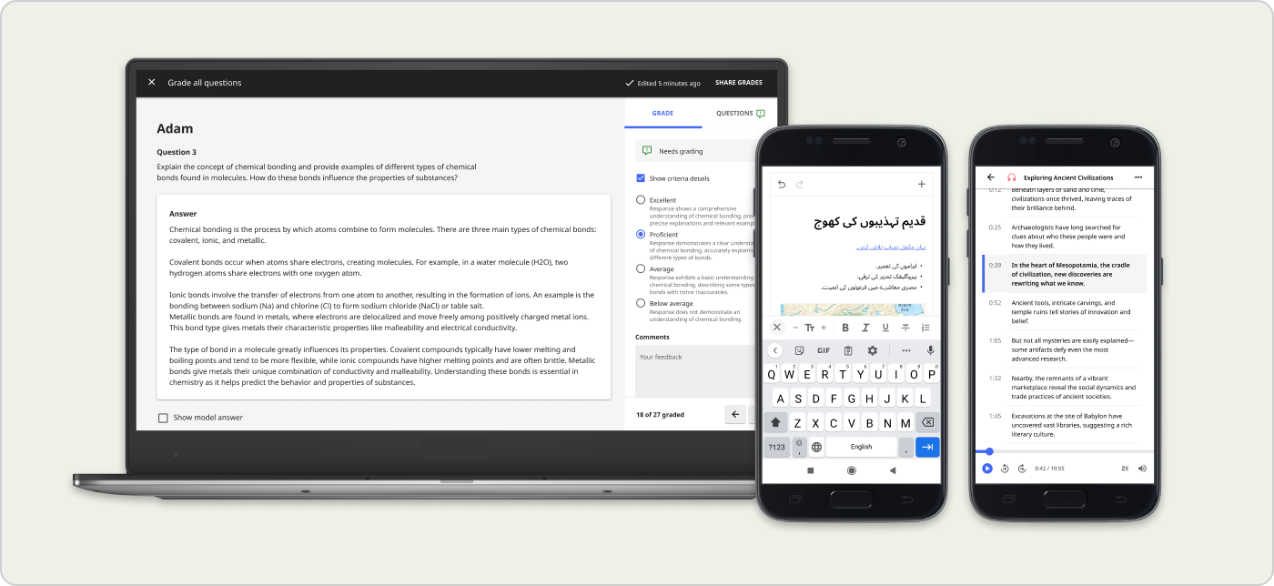
User testing with 12 teachers showed improvements across the board: quicker navigation, clear language, and more perception of value.
Although coach reports were intended to support how teachers made decisions, they found them difficult to use because the data wasn't surfaced in an actionable way. Through observations and accumulated feedback, I identified three reasons why teachers were avoiding it or getting stuck:
Too many clicks
It was taking too long for teachers to find relevant information and identify patterns.
Unintuitive language
Technical jargon that did not speak the same language as teachers.
Vague data
Data was not specific enough for teachers to decide their next steps.
First, I needed to understand what teachers were looking for. I looked at data from education research reports, user interviews and observations, and conversations with team members who had expertise in the field of education.
The coach report tools support different stages of the formative assessment cycle: a low-stakes, informal way that teachers seek to understand what students are retaining throughout the learning process. Think of pop quizzes, quick surveys or polls, or when a teacher simply asks the class what their takeaways are from the lesson they just learned.
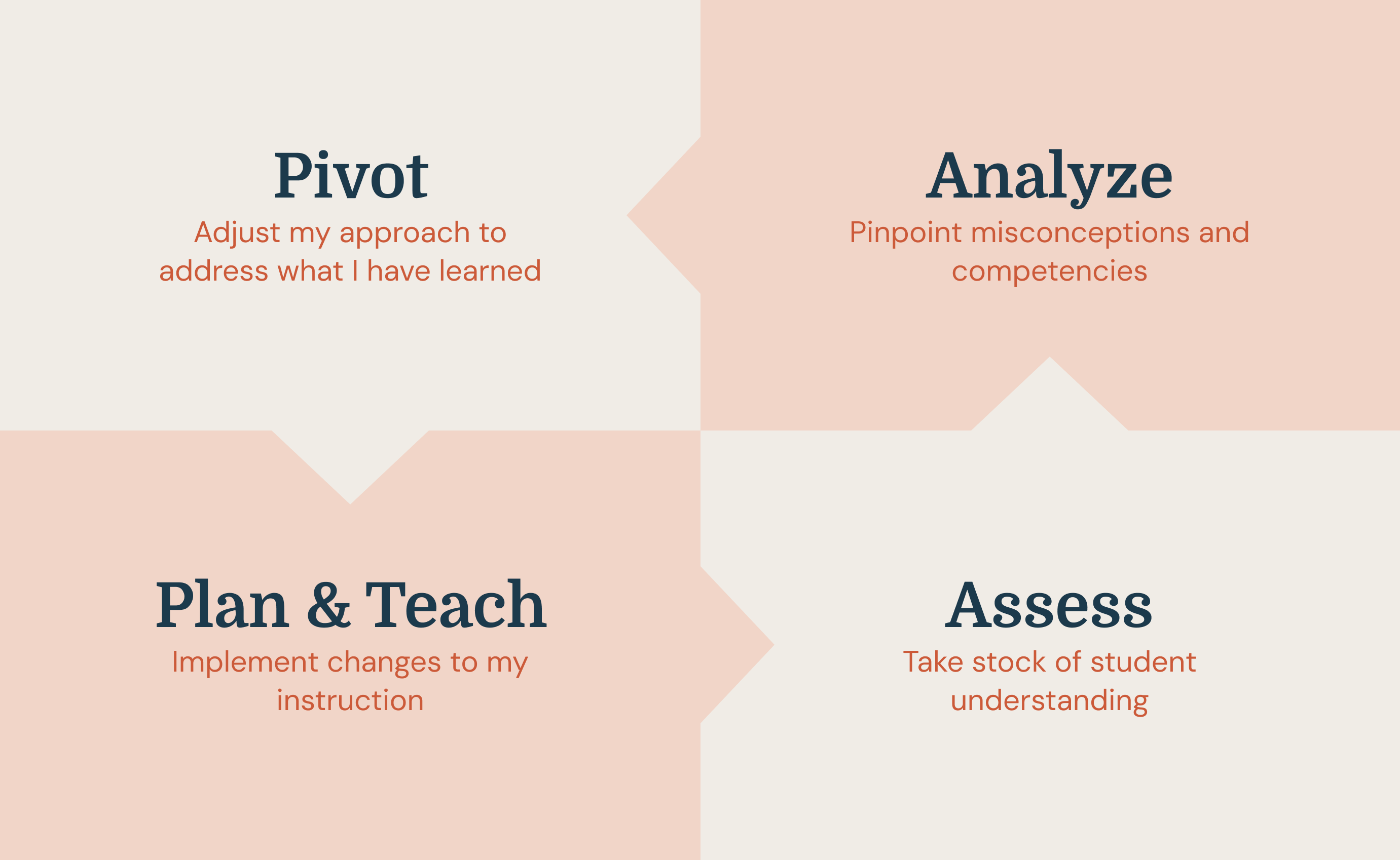
Image credit: Teachers Know Best: Making Data Work For Teachers and Students
I created research-informed simple personas with two major parameters: level of teaching experience and type of learning environment.
Novice teacher, out-of-school catch-up program, new to digital tools
Experienced teacher, secondary school in a refugee camp, new to digital tools
Based on our understanding of the constraints faced by teachers who use Kolibri, I prioritized the needs of teachers who fit the persona of Louise. The updated design should encourage good teaching practices while meeting teachers where they're at, offering support no matter their experience level.
1. Save teachers time
Navigation and data displays should support fast-pace teacher workflows by showing what's happening "here-and-now."
2. Snapshots of strengths and weaknesses
The data should show which students are progressing well or are having trouble with specific concepts.
3. Show patterns across learners
By showing data that groups learners by their performance, teachers can start to plan what they will teach next to who.
4. Support differentiated instruction
Based on this new information, teachers should be able to quickly assign materials and adapt the lesson plan in ways that are appropriate for each students' level of understanding.
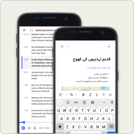
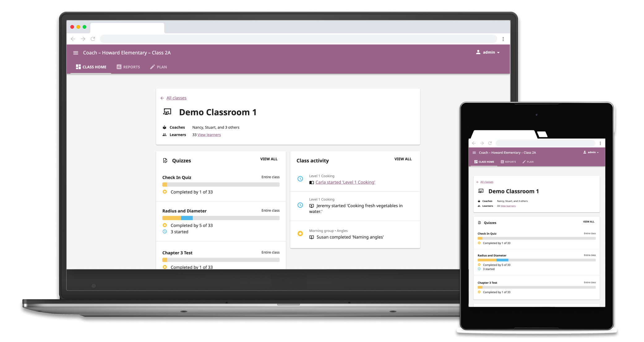
I reduced the top-level navigation from six tabs to three tabs that targeted teacher intent at different stages of the formative assessment cycle: Class home, Reports, and Plan.


Summaries of completion status for different learning materials. To assist real-time monitoring, I included an activity feed that updated at frequent intervals.

The new "needs help" status highlighted what concepts students were getting incorrect answers for in their most recent attempts on questions, drawing more attention to what teachers should focus their next lessons on.

The "needs help" indicator could also be attributed to individual learners so the teacher can get a sense on who they need to follow up with.

Teachers could drill down further to see which specific questions and concepts that students struggled with the most, and identify patterns across difficult concepts and learners.

This "difficult questions" feature naturally created groups of learners who had common misunderstandings to give teachers the information they need to decide interventions at the group and individual level.
12
Current Kolibri users tested
6 >> 3
Top level navigation tabs
100%
Grasped the new information architecture quickly
"Things were all in one place"
100% of teachers quickly understood the new information architecture
"This is what the teachers wanted to know, specifically."
The "Difficult questions" feature automated a pattern that teachers spent a lot of time trying to synthesize looking at individual student data.
Constructive feedback
This project set a strong foundation for how the Product team at Learning Equality understands and talks about teacher needs from a design perspective. The process also helped us figure out how we can work together to create shared foundational understandings of our users that can motivate product direction.
Scoping this project meant dealing with high complexity; in addition to managing UX/technical considerations and team capacity, there were many different social problem areas intersecting and compounding on one another, from educator skill gaps to infrastructure barriers to the upheaval and changes that come while learning as a refugee. Keeping complexity from becoming complicated was challenging. The process highlighted two things: how to distill the most important information about users that directly affects the product design, and the importance of including the perspectives of cross-domain colleagues and stakeholders at every stage of the design process.
Looking back, if I think about the question of "one thing I could have done differently," it would be to find a better balance between over-documentation and "doing design." Good documentation helps a team understand why decisions were made in the long run and have a north star to point to. It also helps a careful approach when designing within problem spaces where there are risks of technology exacerbating already-existing social inequalities. However, tools like user stories and IA maps can only take you so far – the meat of design is in exploration through action, creation, and thoughtful iteration.